
help.sitevision.se always refers to the latest version of Sitevision
Add grid
Responsive web means that you build a website that adapts the appearance depending on what screen resolution the visitor has. This means, for example, that the same website may look different to a visitor if they access the website using a computer, tablet or mobile phone.
For more information on building responsive templates, see Theme Responsive templates.
To do this, follow these steps
To add grids to a website, you need to enable the function under the Responsive web panel. When the function has been enabled, you can add grids.
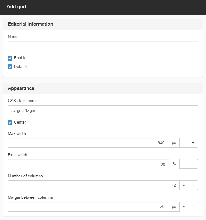
Editorial information
Name
Work name on grid in SiteVision.
Enter a descriptive name (e.g. columns12) so that everyone who works with it knows that it is a grid of twelve columns.
Enable
If you tick this box, the grid is printed in the CSS file. This allows you to keep old grids (which you may not want to discard) but which you can then disable.
Default
Select the grid from the list that you want to be the default. It is the number of columns in this grid that will appear in the right-click menu when you add a grid column.
Appearance
CSS class name
Class name used for the entire grid.
CSS class name must be unique!
Centre
Tick this if the grid is to be centred.
Max width
Grid's starting width. The width that we will start from when we generate the CSS. It should correspond to the width of the website that uses the grid.
Fluid width
When the window size is smaller than the width of the grid, this setting starts to apply. If you have set the grid to be 960px but the window is only 900px wide, the grid will be a certain percentage of it.
This only applies to layouts that are fluid grids, have no effect on fixed grids. Does not apply to stacking, the columns take up 100% of the surface.
Number of columns
Here you set how many columns you want the grid to have. A good number can be 12, 16 or 24.
Margin between columns
How much space to have between the columns in the grid. The margin between the columns multiplied by the number of columns must not exceed the grid width.
For example, if you have 12 columns, you cannot have 90 px spacing if the total width is 960px (12*90 = 1080px).
Delete grid
To delete a grid, select it from the list and click the cross on the right.
Modify grid
To modify a grid, select from in the list and click on the icon to modify the grid to the right.
The page published:
 Print page