
help.sitevision.se always refers to the latest version of Sitevision
The Responsive Web Panel
Responsive web means that you build a website that adapts the appearance depending on what screen resolution the visitor has. This means, for example, that the same website may look different to a visitor if they access the website using a computer, tablet or mobile phone.
For more information on building responsive templates, see Theme Responsive templates.
Enable grids and responsive web
Under the Responsive web panel, you can enable functions to make the website responsive in SiteVision. You need to enable both grids and responsive web for full responsive functionality.
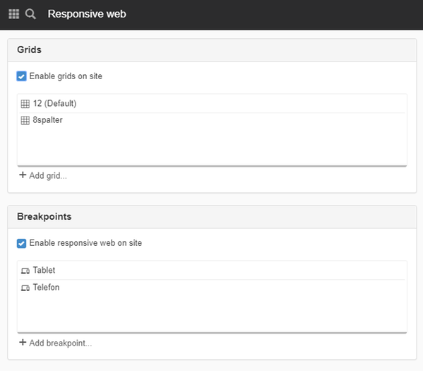
Grids
A grid is used to build templates on the website. A grid is like a network of squares that contains rows and columns that serve as a template where you can place your design (text, images etc.) to make it consistent and clear.
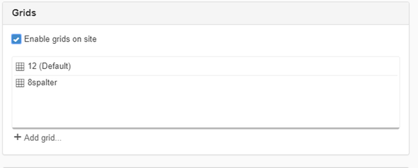
You set up your grid on the website where you specify width, spacing between columns, how many columns to use, and whether it should be centred. You then use grid rows and grid columns to place the content out on your web pages.
Once you have enabled a grid on your website, you can use it when building templates. It is also possible, like layouts, to use them on individual pages.
Enable grids on the website
Once you have enabled grids, it is possible to build templates and web pages with grids. It is then possible to add grids, rows and columns to the pages.
It is a prerequisite to enable grids if you are going to build a responsive web.
The default grid is used when you select "Add grid" for the pages.
Add grid
Click the Add grid button to add a grid to your website. A new view Add grid opens.
Breakpoints
A breakpoint is the width at which the appearance of the web page is changed to adapt to different devices such as phone, tablet, and computer.
The order of the breakpoints is important. If the breakpoints overlap, the breakpoint that is last in the list applies. Sort the breakpoints with the largest at the top, starting with large screen - when the screen get smaller, the different breakpoints apply.
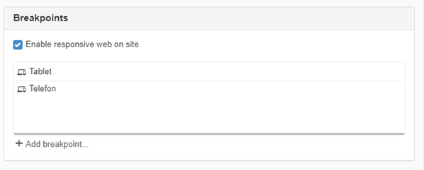
Enable responsive web on site
Tick the Enable responsive web checkbox for the website to start using all the functions that make your website responsive.
Enabling means:
- Automatic rescaling of the image modules and YouTube modules.
- Any breakpoints will be activated (printed in the CSS)
- You will get settings on modules and layouts to view/hide and breakpoints
Breakpoints
Here you can add, modify, delete, and sort breakpoints.
Click the Add breakpoint button to add a breakpoint. A new dialogue box appears.
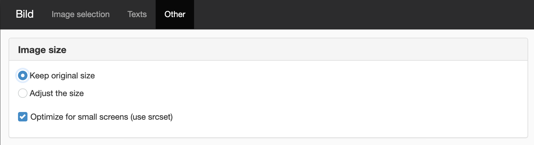
Support for responsive images
When the website is responsive, we have support for responsive images. If an image module is placed in the content of the page, it should be given a src in addition to srcset with scaled-down versions of the image.
If you have "Manage functions for developers" permission, there is an additional checkbox on images where you can choose to disable this rescaling.
Additional setting for those who have "Manage Developer Features" permission
Modules WITH srcset:
- Image
- News
- Blog
- Slideshow (new)
- Random image
- Script module and all custom templates that use ImageRenderer.
This function requires you to have “Manage website settings” and "Manage responsive web" permissions.
The page published:
 Print page