
help.sitevision.se always refers to the latest version of Sitevision
Responsive templates
Responsive web means that you build a website that adjusts in appearance depending on what screen resolution the visitor has. This means, for example, that the same website may look different to a visitor if they visit the website using a computer, tablet or mobile phone.
The images below show a website built with the new technology where a computer, a tablet and a mobile phone were used to show the same page.
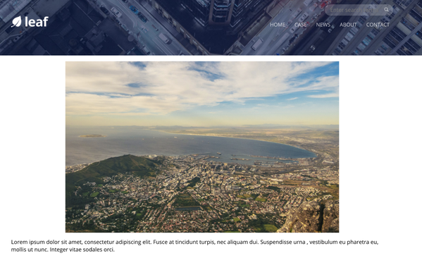
Computer
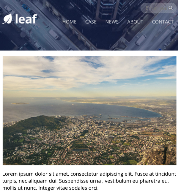
Tablet
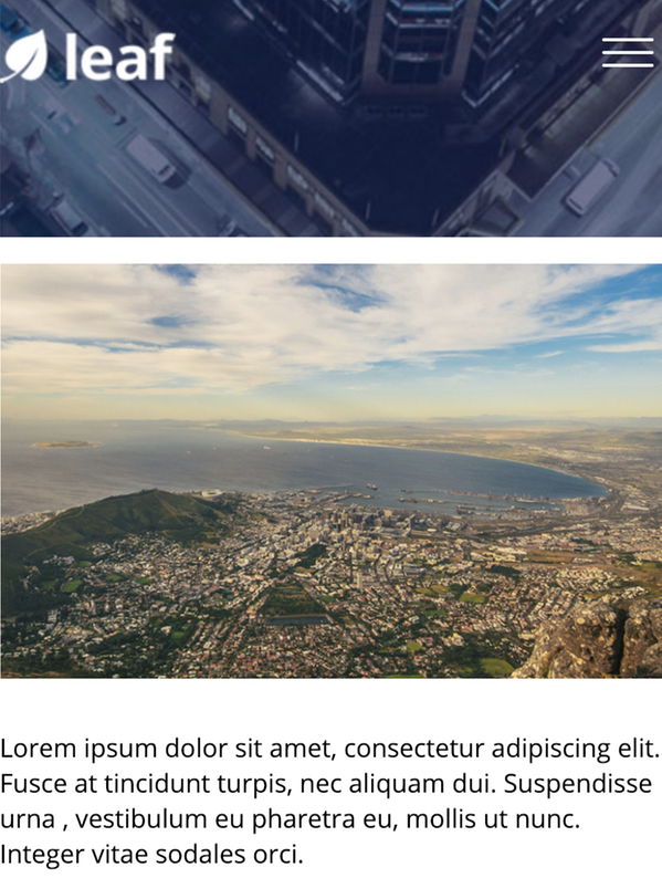
Phone
Good to know before you start creating templates
Before you begin building your templates, you need to know concepts such as layout, content area and template area. You should also consider how the templates should look and whether they should meet any specific requirements, such as accessibility.
It is important that you prepare when building templates. You need to set up style sheets, website colours, and metadata to use. For responsive websites, you also need to enable responsive web, add breakpoints and make settings for the grid to be used.
Because the template parts are the basis for all other templates, it is important to protect them so that no unauthorised person can make changes by mistake.
To build templates, it is good if you have the permissions "Show templates", "Create templates", "Manage responsive web", "Add grid, grid row and grid column","Manage page layout ", "Manage colours"and " Manage style sheets".
The page published:
 Print page