
help.sitevision.se always refers to the latest version of Sitevision
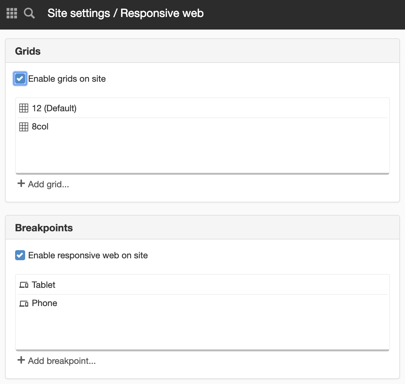
Add breakpoints to the website
Responsive web means that you build a website that adapts its appearance depending on what screen resolution the visitor has. This is done with so-called breakpoints.
However, it is important that you think about adapting to your content on your website and not just to the dimension of an iPhone, for example. Questions that you may face when you set these breakpoints might be:
- When does the website start having resolution problems?
- Is the text difficult to read?
- How do we manage the menu? When do we have to adjust it?
Breakpoints
A breakpoint (media queries) means that you can restrict the use of certain CSS. Currently, this can be restricted based on the browser's minimum and maximum width. You can assign different settings for breakpoints:
- Grids - to stack columns
- Layouts/modules - to show/hide things
- Custom CSS
Under Website settings-> Templates-> Responsive web , you can add, modify, delete, and sort breakpoints.
Do not design from, for example, an iPhone/Ipad, remember that there are other phones and tablets.
Add breakpoint for telephone
Click the Add breakpoint link to add a breakpoint. For example, if you want a breakpoint for a phone, set the maximum width to be 480px.
A new view appears:
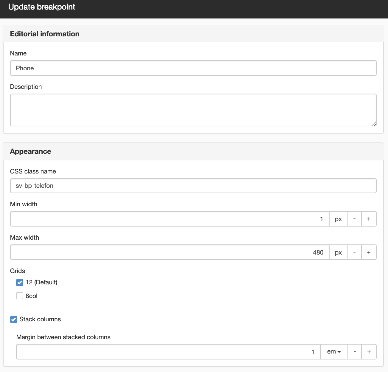
- Name (Mandatory) - The working name of the breakpoint that will appear in SiteVision.
- Description - A description of the breakpoint, so that editors understand when to use it
- CSS class name (Mandatory) - Here you specify a CSS class name for the breakpoint. Two class names are generated based on what you enter - sv-visible-<classname> and sv-hide-<classname>. These will be used to hide/show things in breakpoints.
- Min width - Here you set the minimum width to which the breakpoint should apply. If you specify no width, it will be from 0 to the maximum width (in this case, 0-480px).
- Max width - Here you set the width to which the breakpoint should apply.
- Grids - Here you can add links to grids in order for you to be able to stack columns in the specified grids. Tick the box to link to the grid.
- Stack columns - If you tick this box, all columns will be stacked on each other instead of next to each other.
- Margin between stacked columns - Here you can set a margin that appears when you stack columns.
- Custom CSS - Here you can enter a custom CSS that should only apply in this breakpoint.
This function requires you to have "Manage responsive web" permission.
The page published:
 Print page