
help.sitevision.se always refers to the latest version of Sitevision
Plan templates
Before responsive
The best approach to convert existing, non-responsive, templates to responsive is to start over completely from scratch. Plan the responsive appearance and functionality based on the devices the website will be designed for.
Many people think it is a good idea to think "mobile first". This basically means focusing on what is important for the website, starting from that and starting to build based on the smallest format (telephones). Things are then added when the format is larger (instead of deleting things when the screen shrinks). One reason for this is that all content is loaded despite a limitation to what is to be seen. This means that all content that is available for normal computer resolution is also loaded for the mobile solution.
Designs for three different types of resolutions are common:
- Computer (up to 978 px)
- Tablet (up to 768px)
- Telephone (up to 480px)
Be sure to start from your website! If the design works equally well for computer resolution and tablet resolution, there is no point in creating a breakpoint for a tablet. A breakpoint for a smaller screen resolution may then be sufficient (such as a telephone).
Here is an example with only a computer resolution and a telephone resolution:
TOP MENU
SEARCH
LOGO
IMAGE
CONTENT
CONTENT
BOX
BOX
BOX
CONTACT DETAILS
1. Appearance on computer
TOP MENU (dropdown)
SEARCH
LOGO
IMAGE
CONTENT
CONTENT
BOX
BOX
BOX
CONTACT DETAILS
2. Appearance on telephone
The top menu is replaced with a dropdown menu. Search has to be on a separate row under the menu. Both content and puffs are stacked instead of lying next to each other.
Planning template areas and content areas
It is good to know how other templates should look (not just the home page) when creating the first template. Before the responsive build begins, it is a good idea to sketch out a simple drawing of the templates. Plan the template and content areas to get a good structure,because the templates are built on each other.
- Template areas marks the areas in the template that can be changed when building the next template.
- Content areas means the areas that the editor has the right to add content to.
Tip! Avoid nested columns and grid rows. Try to keep the number of start templates down to simplify the handling of the different areas in the template.
In this example, sketches are shown for the larger resolution, but the other resolutions are noted.
1. One column (wide template)
1. Two column (standard template)
3. News template
4. Start template
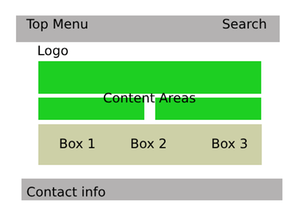
Based on the above sketches, we build five different templates, a template part with template area, and four templates with content areas:
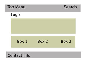
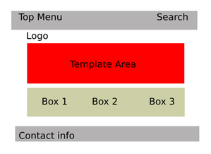
1. Template parts - Start template
Here we build a start template with
- Top header (100% grey background)
- Top menu (8 columns wide)
- Search (4 columns wide)
- Header
- Logo (12 columns wide)
- Template area (marks the area for new templates based on this template)
- Footer
- Box 1 (4 columns wide)
- Box 2 (4 columns wide)
- Box 3 (4 columns wide)
- Bottom footer (100% grey background)
- Contact details (12 columns wide)
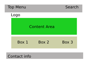
2. Template 1 — one column
The template is based on the start template (so are all the templates in the example).
The template consists of only one column so we add a grid row and convert it to a content area.
- Centre column (content area, 12 columns)
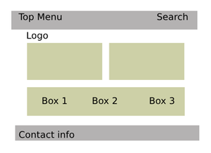
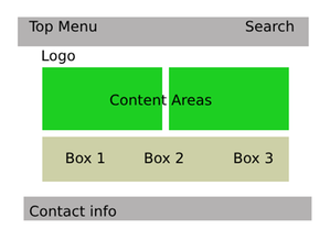
2. Template 2 — Standard (2 columns)
The template is based on the output template.
The area for the template area is divided into two parts, where each part consists of a column containing columns:
- Centre column (content area, 6 columns)
- Right column (content area, 6 columns)
Convert the two areas to content areas.
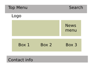
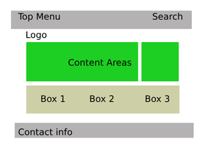
3. Template 3 — News template
The template is based on the output template.
The area for the template area is divided into two parts, where each part consists of a column containing columns:
- Centre column (content area, 8 columns)
- Right column (news menu, 4 columns)
Convert Centre column to a content area.
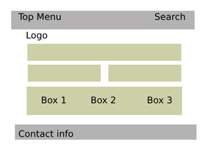
4. Template 4 — Start template
The template is based on the output template.
The area for the template area is divided into three parts divided into two rows. Add two grid rows. Add a column with all columns in width in the top row. Split the bottom row into two columns where each column is given a width specified in columns.
- Row
- Top image (content area, 12 columns)
- Row
- Centre column (content area, 6 columns)
- Right column (content area, 6 columns)
Convert all three areas to content areas.
The page published:
 Print page