
help.sitevision.se always refers to the latest version of Sitevision
Grids
A grid can be described as a network of boxes containing rows and columns. It serves as a template for where the design (text, image etc.) is placed in order to make the layout consistent and clear.
A grid is set centrally on the website. It specifies the width, spacing between columns, how many columns to use, and whether the grid should be centred.
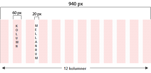
The example above shows a grid that is 940 px wide
Spacing 20 px (20 px * 11 columns) = 220 px
Column 60 px (940 px-220 = 720 px/12 columns)
The spacing between the columns is to the left of each column (except the first one).
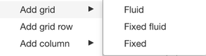
Grid type
When a grid is created on the website, it can be used in the template. There, select the grid type (if it should be Pixel based or Percent based).
- Fluid grid
- Percent based - adjusts to the size of the browser window
- Fixed fluid grid
- Percent based - adjusts to the size of the browser window, but the columns become consistent if they are nested
- Fixed grid
- Pixel based - the columns are fixed, regardless of the size of the browser window
Use Fluid grid or Fixed fluid grid to build responsively.
The page published:
 Print page