
help.sitevision.se always refers to the latest version of Sitevision
Use breakpoints in the templates
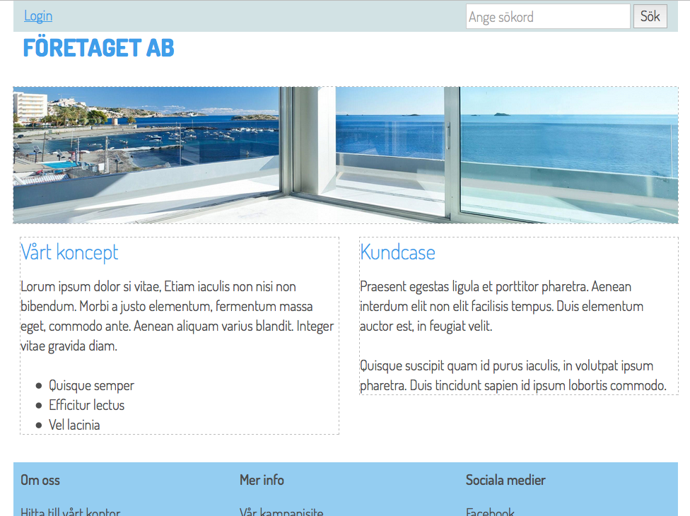
Now the templates look like this (home page) for a computer:
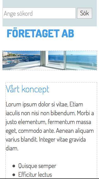
Appearance with a phone (max 480px):
Hide in breakpoints
The columns are stacked in telephone mode but you need to replace the menu with a dropdown list (or mobile menu if you have one). To do this, go to the template where the menu is located (in this case Start template). Select the existing menu and select Properties-> Responsive web > Hide in breakpoints:
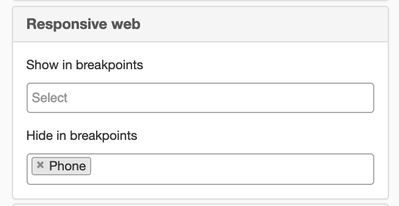
Keep in mind that you only hide content. All content is on the page and is loaded even though you have restricted what can be seen. This means that all content that is available for normal computer resolution is also loaded for the mobile solution, even though it is not shown. This is good to keep in mind when planning how your templates work.
Show in breakpoints
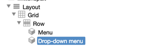
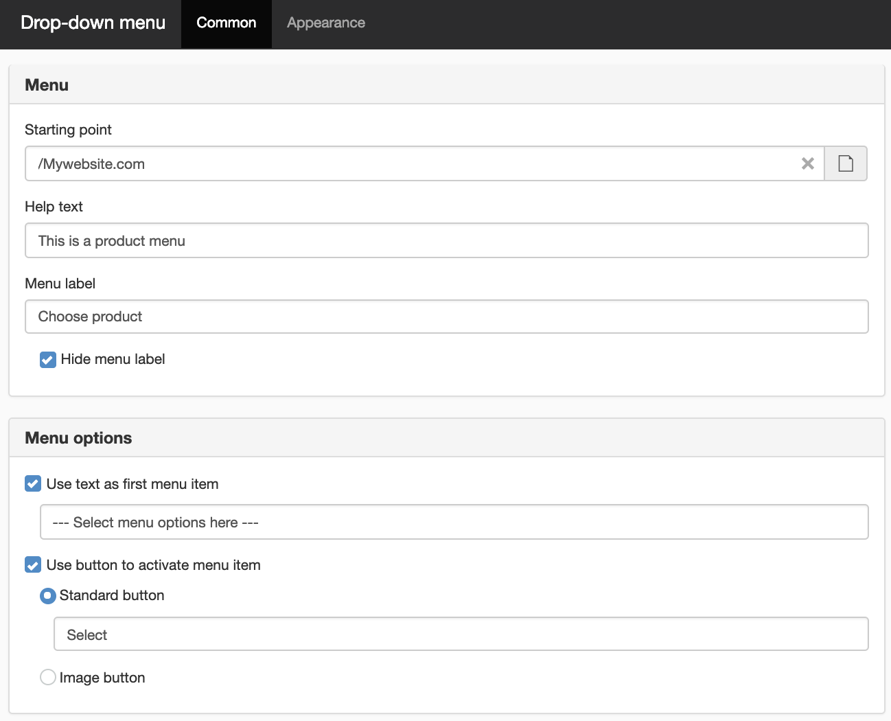
Select the Top menu column and add a drop-down menu:
A new window opens where you can set your preferences:
Select the dropdown menu and select Properties-> Responsive web > Only show in breakpoints
-> Telephone:
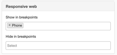
Now the dropdown menu is only displayed in phone mode:
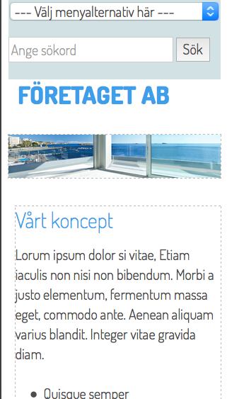
The page published:
 Print page