
help.sitevision.se always refers to the latest version of Sitevision
Survey - Appearance
Under this tab, you can set appearance changes for the survey.
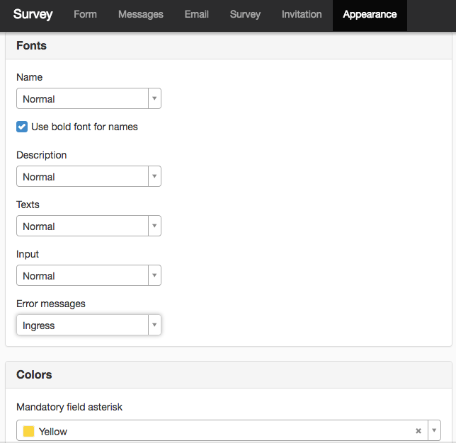
Fonts
Here you can change fonts for
- Name - the field name
- Description - if you have chosen to fill in the Description field.
- Texts - plain text and questions
- Input - what the visitor enters
- Error messages — for example, if the visitor forgot to fill in a mandatory field
Use bold font for names
Tick this if you want the names of the questions to appear in bold.
Colors
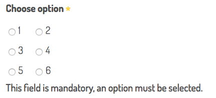
Mandatory question asterisk
Here you choose the color of the asterisk (*) that indicates that the question is mandatory.
Show fields on colored plates
Here you can choose to show the questions on plates, otherwise they will appear as plain text without any backgrounds or borders.
- Background field - the background color that appears as a plate behind the question
- Background input - the background color that appears behind the input
- Borders - the color of the borders around the question
Other
Spacing between fields
Here you can set whether you want more or less space between the fields. The default value is 10 pixels. You can change the unit to EM.
Description alignment
You can select:
- Below the field
- Above the field
The location depends on the nature of the description. This setting is only available in the new form manager.
Submit button text
Here you change the text of the Submit button. The default text is Submit.
Mark fields with validation errors
If you tick this box, the fields that are incorrect will turn red. Does not apply to "input type" (that is, checks if @ is filled in the e-mail input type), but if, for example, a single selection question that is mandatory is not filled in. This setting is only available in the new form manager.
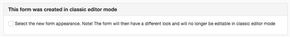
Use the new form appearance
If you open a form that has been created in Classic mode or a version earlier than SiteVision 4, this option is at the top where you can choose to use the new form appearance.
Note that in the various e-mail messages, only the new Name field is included. The old Name field and the new Description field are not printed in the e-mail.
If you are using the new appearance, what was in the old "Name" field is moved to "Description" and what was in the "Question" field is moved to "Name". This means that you have to move some things around in your form if you want a similar appearance as before. For example, delete the description and paste it in Name.
Here you can see an example of a form with this checkbox ticked.
The form will no longer be editable in Classic mode if you have ticked this box.
You may need to make some adjustments to the form to make it look good. This means a little extra work to convert to the new form appearance. But in return you get responsive forms and some more setting options.
The page published:
 Print page