
help.sitevision.se always refers to the latest version of Sitevision
Decorations and buttons
See examples of buttons and decorations that you can use on the intranet.
Button module appearance settings
The button module will have a different appearance depending on the color options you set. The options are taken from your website theme. You can manage this under: Website settings / Appearance / Theme / Elements.
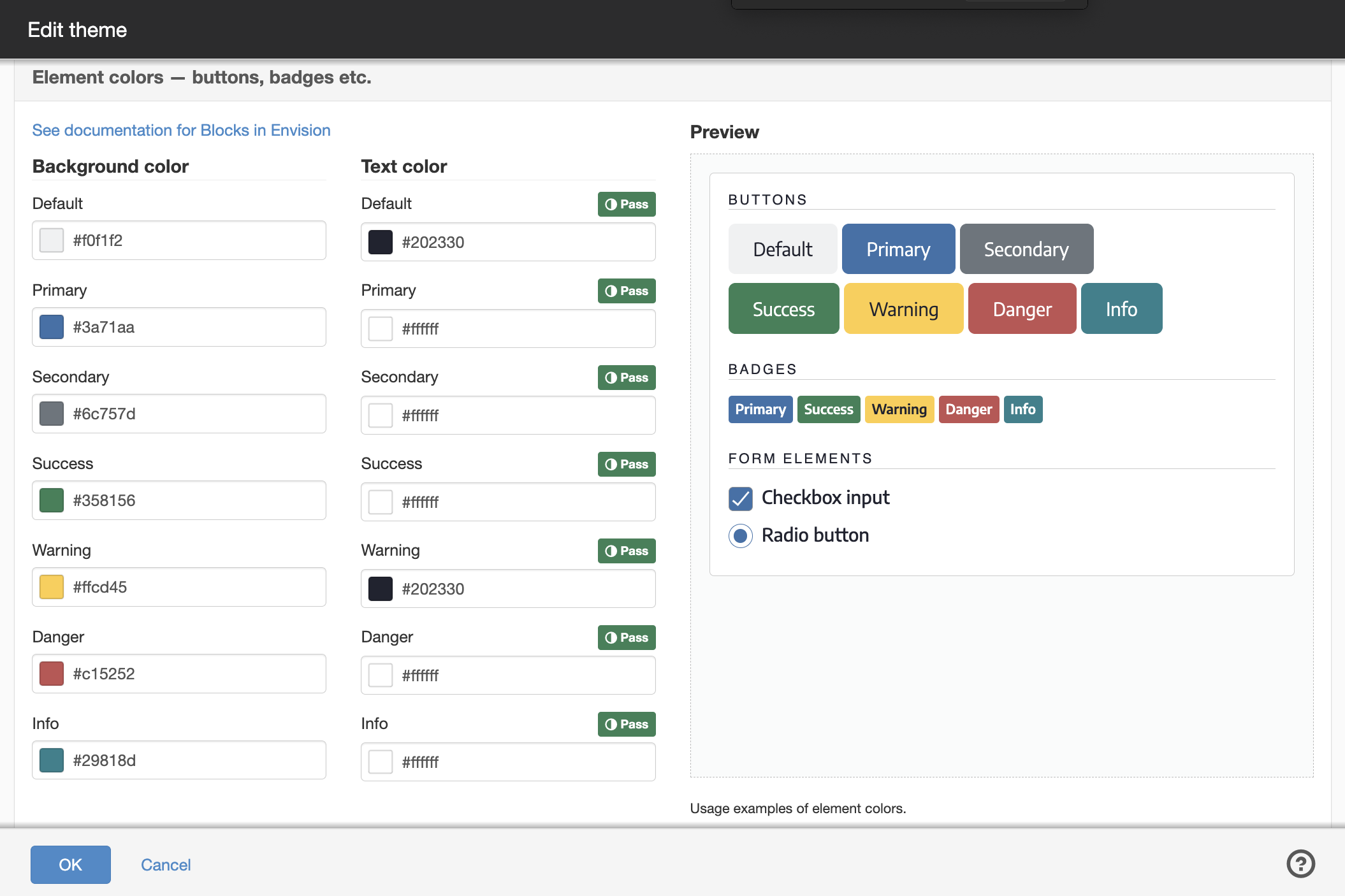
Decorations
You can use the following decorations to influence the appearance of individual modules/layouts on the intranet:
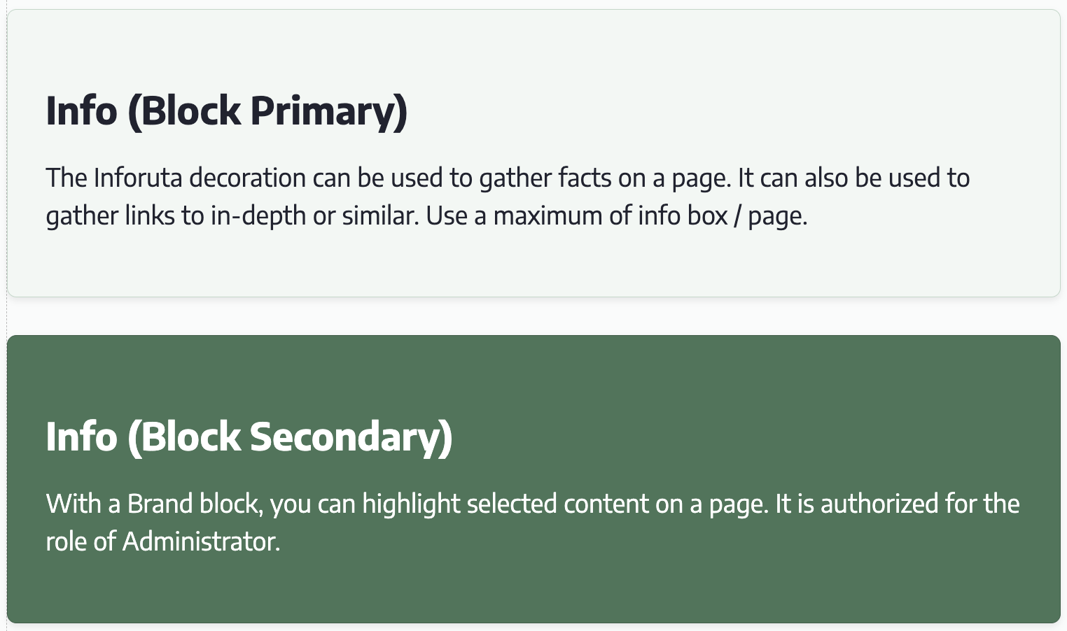
- Inforuta (Block Primary)
- Inforuta (Block Secondary)
- Content box
- Collapsible field
- Full width module
Using a decoration
Right-click on a module/layout, select Decoration and then the decoration you want to use.
By default, all roles have permission to use the decorations Inforuta (Block Primary) and Collapsible field. Other decorations are permission controlled to the Administrator role.
You can change the permission setting for a decoration under Website settings / Appearance / Decorations.
Here you can read more about decorations in general.
Inforuta (Block Primary)
The Inforuta decoration can be used to collect facts on a page. It can also be used to collect links to in-depth information or similar. Use a maximum of one inforuta/page.
Inforuta (Block Secondary)
With an Inforuta (Block Secondary) you can highlight selected content on a page. It is authorized to the Administrator role.
Content box
The Content Box decoration is mainly used in the templates to give white background color to different components.
By default, the Content Box is limited to the administrator role.
Collapsible field
The Collapsible Bar decoration is used to gather content in a module/layout. The field can be unfolded and folded and can be used, for example, to create an FAQ or offer in-depth information.
The title is taken from the name of the module/layout. To change the name, right-click on the module/layout in the content box and select Rename.
Full width module
The Full Width Module decoration can be used to make a module wider than the standard column width. For example, it can be used on image modules to display a wider image.
The page published:
 Print page